Monitoring Metrics #2: Visualizing Anomalies in Collections of Metrics
September 22, 2023
This is the second post in our “Monitoring Metrics” series. We’ll cover how to use Anomalo to monitor multiple metrics at once and stay clear of common pitfalls that statisticians face.
Think about visiting the doctor and getting your vitals measured. A doctor doesn’t prescribe a treatment based on one single metric like body temperature—they look at many signals together. Similarly, data practitioners analyze entire collections of metrics to support business decisions. Whether you’re examining the performance of a user funnel through multiple stages, or breaking down sales data across demographic segments, you need multiple metrics to understand the whole picture.
When scaling from monitoring one metric to monitoring many, the core approach remains the same. You still need dynamic thresholds to catch anomalous values while reducing noisy alerts. It’s also still important to have explainable predictions and actionable visualizations, features of Anomalo that we highlighted in Visualizing the Variations in a Single Key Metric.
It would then seem that monitoring multiple metrics is just a matter of repeating the methods for a single metric. This approach, however, has many shortcomings and is the reason the “multiple testing problem” is a deep field of research in statistics.
In this post, we will cover:
- The challenges of scaling up to multiple metrics
- Configuring metrics collections in Anomalo
- Reducing false positive alerts
- High-level monitoring with the status grid in Anomalo
- Visualizing time series data by metric and segment
More metrics, more problems
Individually configuring monitoring for every single metric of interest is time-consuming. Suppose you want to monitor a product’s revenue in each of the dozens of markets where the product is available. It’s going to take quite a while to set up and maintain monitoring in every one of those markets.
Not only does it take more time to monitor so many metrics, but errors are more likely, too. It’s hard to duplicate the monitoring logic for a metric across so many segments without slight discrepancies accruing over time. This problem isn’t just the case when monitoring different segments of the same metric. Often, teams fail to maintain consistency between related metrics. For instance, two teams may have a different concept of what counts as a “click” in their cross-platform app.
Then there’s the infamous problem of false positives that come with monitoring many metrics at once: known by many names, including p-hacking and data dredging, this is the phenomenon of running many statistical tests in parallel and cherry picking spurious correlations. Suppose you’re monitoring 100 metrics using 95% confidence intervals. As the name implies, 95% confidence intervals aren’t perfect—even when all 100 metrics are perfectly healthy, some of them will fall outside their confidence intervals per the following distribution:
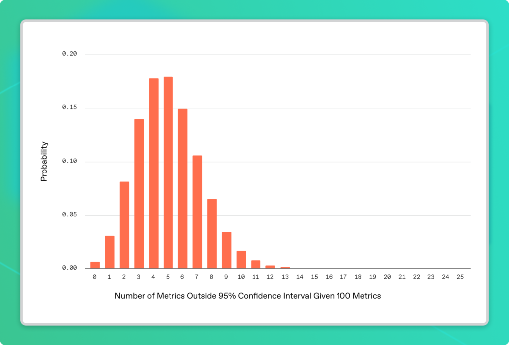
On average, 5 out of 100 metrics will exhibit this behavior. In fact, it would be statistically peculiar (a less than 1% chance) if every single metric stayed within range. By taking this naive approach, it’s pretty much guaranteed you’ll get false-positive alerts daily from random noise alone.
Getting alerted daily for issues that do not exist inevitably leads to alert fatigue. Alert fatigue erodes trust not only in the data but also in the data monitoring system itself—a huge setback.
The good news is that monitoring multiple metrics doesn’t have to be this way.
Qualities of a scalable approach to multiple metrics monitoring
If monitoring each metric in a collection as a singleton isn’t scalable, how should you monitor many metrics together?
A better approach to monitoring metrics at scale includes:
- Define-once, use-everywhere configuration for metrics
- Automatic tuning out of random noise to minimize false positive alerts
- Powerful visualizations to examine metric trends and reason about alerts
Anomalo helps you do all this and more, as we’ll highlight in the next section.
Use Anomalo to monitor collections of metrics
Let’s use the example of a dataset of global newspaper articles to see how you can use Anomalo to monitor a suite of metrics. The dataset catalogs each article’s date, country of publication, and document tone (a measure of the article’s sentiment). We can aggregate articles by country and over time, looking for anomalies as indicators of major world events.
Configure a collection of metrics in Anomalo
Setting up monitoring for a metrics collection is very similar to how you’d configure an individual metric. From your table’s Overview page, scroll to the Key Metrics section under Data Quality and click the + button to add a new metric. Then, under the section for Custom Metric Collection, select “Collection of metrics are not anomalous.”
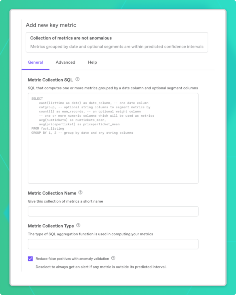
Next, fill out the form with a SQL query for the metrics you want to track as a collection. The only required columns are a date column and one or more metric aggregations. Optionally, you can group by a segment column to slice your data accordingly. For our news dataset, we’ve segmented it by country.
Finally, give the metric collection a name and choose a SQL aggregation function for the Metric Collection Type. This field specifies how data from separate segments gets combined. For instance, we’ve averaged our news metrics over all the country segments. Be sure to leave the box for reducing false positives checked so that Anomalo can help you distinguish noise from especially unusual events. Save your metric collection and Anomalo starts running its checks right away.
Investigate alerts
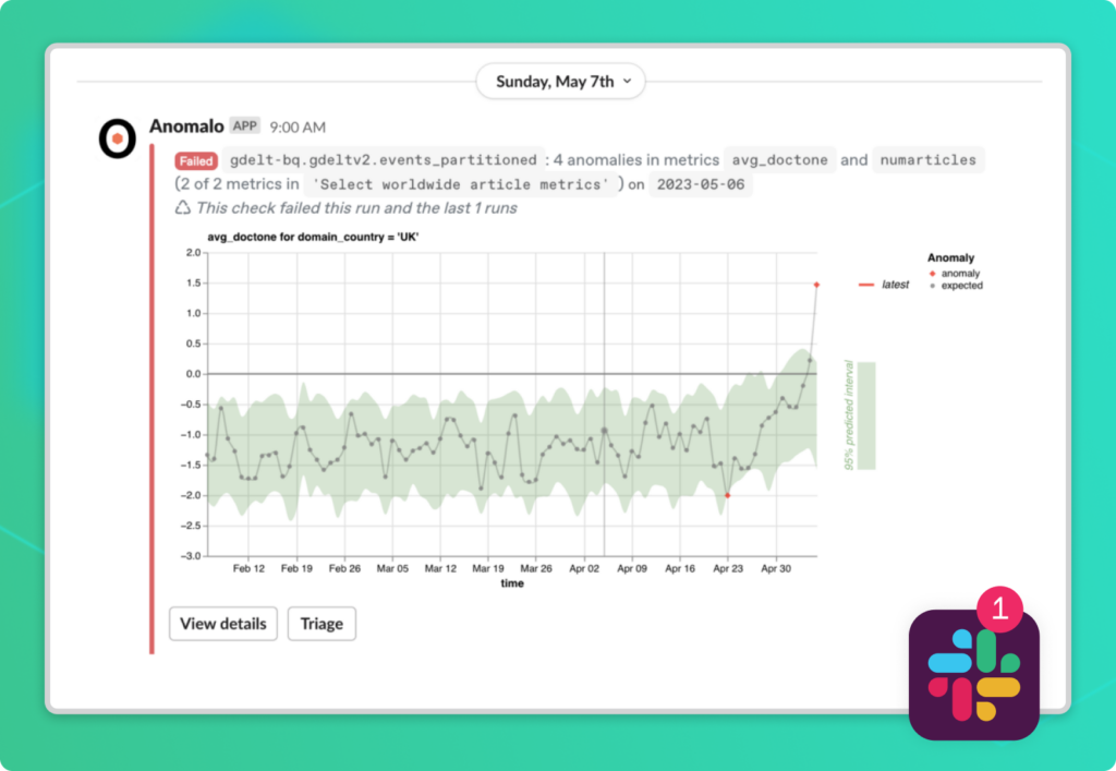
We’ve been monitoring our news table for a while already—it looks like we got a Slack notification alerting us about 4 anomalies in two of our metrics on May 6, 2023. Let’s investigate.
Reduce false positives with anomaly validation
In the alert above you can see the most anomalous metric for that day, but before moving on, it’s worth understanding if this alert is likely a false positive.
Because we left the option for reducing false positives enabled, Anomalo performs anomaly validation, which raises our confidence that the May 6 alert is a meaningful one.
How does false positive validation work?
With anomaly validation enabled, Anomalo computes two additional time series metrics in addition to its usual analyses:
- The magnitude of the most extreme anomaly
- The number of anomalous metrics
Anomalo will only trigger an alert if any metric you’re monitoring is anomalous and at least one of these two metrics is outside its confidence interval.
Without going too deep into the technical details, the rationale for these additional time series is that there should either be a) an extreme number of anomalies or b) at least one anomaly of extreme size as evidence of a truly unusual occurrence. With this validation technique enabled, Anomalo can distinguish between random noise and legitimate anomalies, triggering alerts exclusively for the latter.
For our example dataset, Anomalo generates the following time series plots:
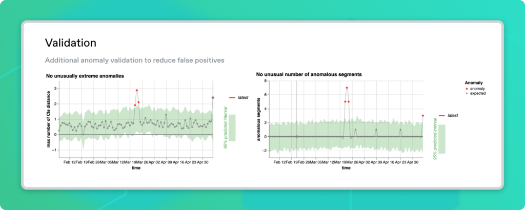
We can see that May 6 has both an unusually large number of anomalies and that the most anomalous time series is especially outside its confidence interval. These are good indicators that the anomaly is genuine, so it’s worth our attention to figure out what happened.
High-level monitoring with the status grid
The status grid in Anomalo provides an overview of all the metrics in a collection so you can decide which metrics merit further investigation. If you configured segments, each row of the grid corresponds to a particular one, which can be helpful in finding anomalies involving only a subset of the data.
For our newspaper dataset, the status grid on May 6 looked like this. It includes metrics for document tone and the total number of unique articles, both of which are segmented by country:
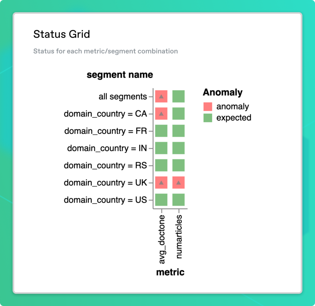
Green squares show metrics in the expected range while red squares highlight potential anomalies. Keep in mind that it’s perfectly normal for there to be some red squares when monitoring many metrics at once (especially if we showed nearly 200 countries on the grid instead of just a handful!). That’s why the status grid is just a bird’s-eye view and complements the anomaly validation we enabled earlier.
It seems that there is something going on both in the number of articles and the average article sentiment in the UK. Maybe there’s also something worth digging into for Canada.
Visualize the most anomalous time series
Among all the metrics and segments flagged as potential anomalies in the Status Grid, the most extreme one is probably the first place worth investigating, as it’s very likely to be a true anomaly. Anomalo displays the Most Anomalous Time Series as the top-most visualization in a custom metric collection. This chart highlights the anomaly that is furthest outside its expected range.
Much like the Forecast Zoom plot we covered in part 1 of this series on monitoring a single metric, the Most Anomalous Time Series plot shows historical data as it relates to the fitted time series model in green. Past data points falling outside the confidence interval band appear in red.
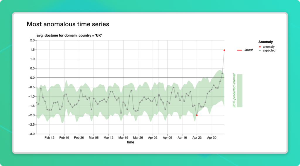
In our example, the most anomalous time series is for the average document tone in the UK. Newspaper sentiment in the country was unexpectedly positive on May 6 and we can see the trend leading up to this point in time. This visualization could provide clues about the nature of an anomaly in a level of detail that a red square on the status grid can’t match. We can see that document tone tends to be negative most of the time, so it’s really an aberration that the anomaly is well into the positive range.
Analyze metric segments
So we’ve looked at document tone in the UK, but what about the rest of the world? For starters, we can look at the Metrics Series charts, which visualize each of our metrics aggregated over all segments. This way, we can see the worldwide trends.
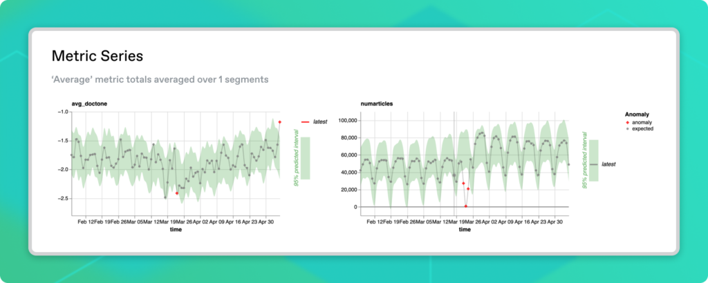
The first visualization shows that document tone is unexpectedly positive on the whole. The UK is a part of that trend, although other countries could also be driving it. From the second graph, we see that the number of articles has been stable in the preceding few weeks, with a clear difference between weekdays and weekends. There also seems to be evidence of a data outage around mid-March.
While the Metrics Series plots give us a feel for the dataset as a whole, we should probably dig deeper into country-specific trends. Anomalo produces similar time series visualizations for every metric-segment combination. This way, you can investigate other red squares on the Status Grid.
Recall that the UK had an unusual number of articles in addition to a change in news sentiment. Here’s what the Segment Metric Series for that looks like:

Once again, we see evidence of an outage in mid-March. More relevant to our current area of interest, there’s an uptick in early May. The latest data point appears to buck the trend of fewer articles being published on weekends.
The other metric we should check is the average document tone in Canada, which was flagged earlier. Let’s also examine the US as a comparison.
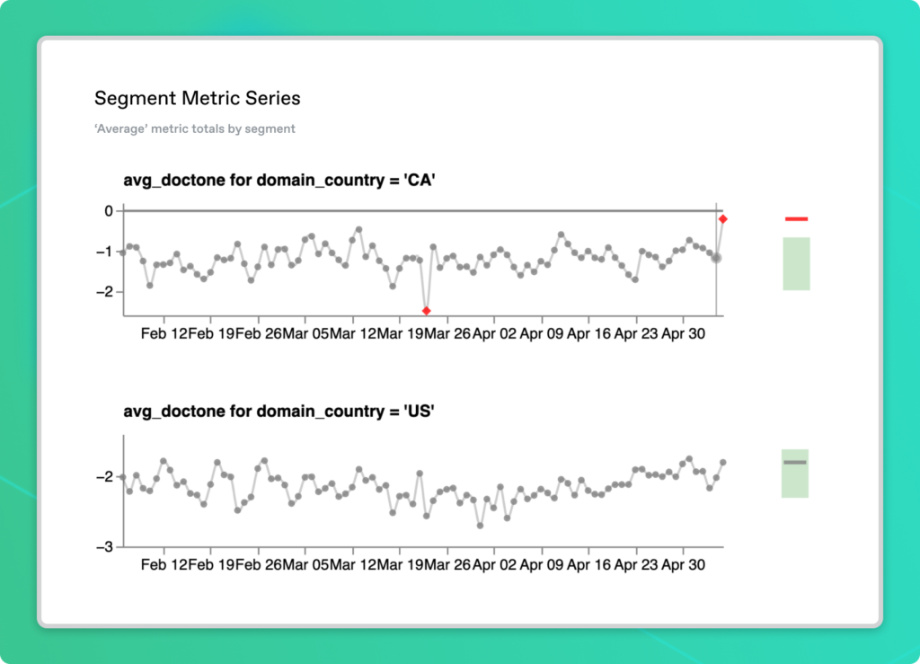
Consistent with the worldwide metric series we looked at before, average sentiment tends to be negative in both the US and Canada. For May 6, the document tone in the US is in its normal range whereas Canada has a value greater than anything in the three months prior. Unlike the UK though, this anomaly doesn’t quite cross over into positive values. Could the same event be gaining traction in both the Canadian and British press? Or maybe this is a mere coincidence?
Identifying the root cause
Have you figured out what the anomaly on May 6 was?
With Anomalo, you don’t have to be an expert in recalling world events to solve the puzzle. Back on the main Anomalo page for our table, we can poke through sample data on that day for the countries of interest. We see a lot of the positive sentiment articles in the UK were documenting the coronation of King Charles III. Canada also had similar coverage, but there appears to be a lower volume of articles and some more critical pieces relative to the UK.
We’ve now seen the full cycle of monitoring a collection of metrics while avoiding many of the struggles data teams face when scaling up their data quality efforts. Anomalo simplifies the configuration aspects of metrics monitoring and also gives the critical context that separates false positives from true data anomalies. From scanning the big picture with the Status Grid, to delving into specific time series charts, data teams are equipped to quickly identify issues and notice underlying trends.
If you want to talk directly to an Anomalo team member to learn more about how Anomalo can serve your business, reach out for a demo today.
Related Resources
Learn more by browsing our library of announcements, guides, and technical deep dives on data quality.


Ready to Trust Your Data? Let’s Get Started
Meet with our team to see how Anomalo transforms data quality from a challenge into a competitive edge.